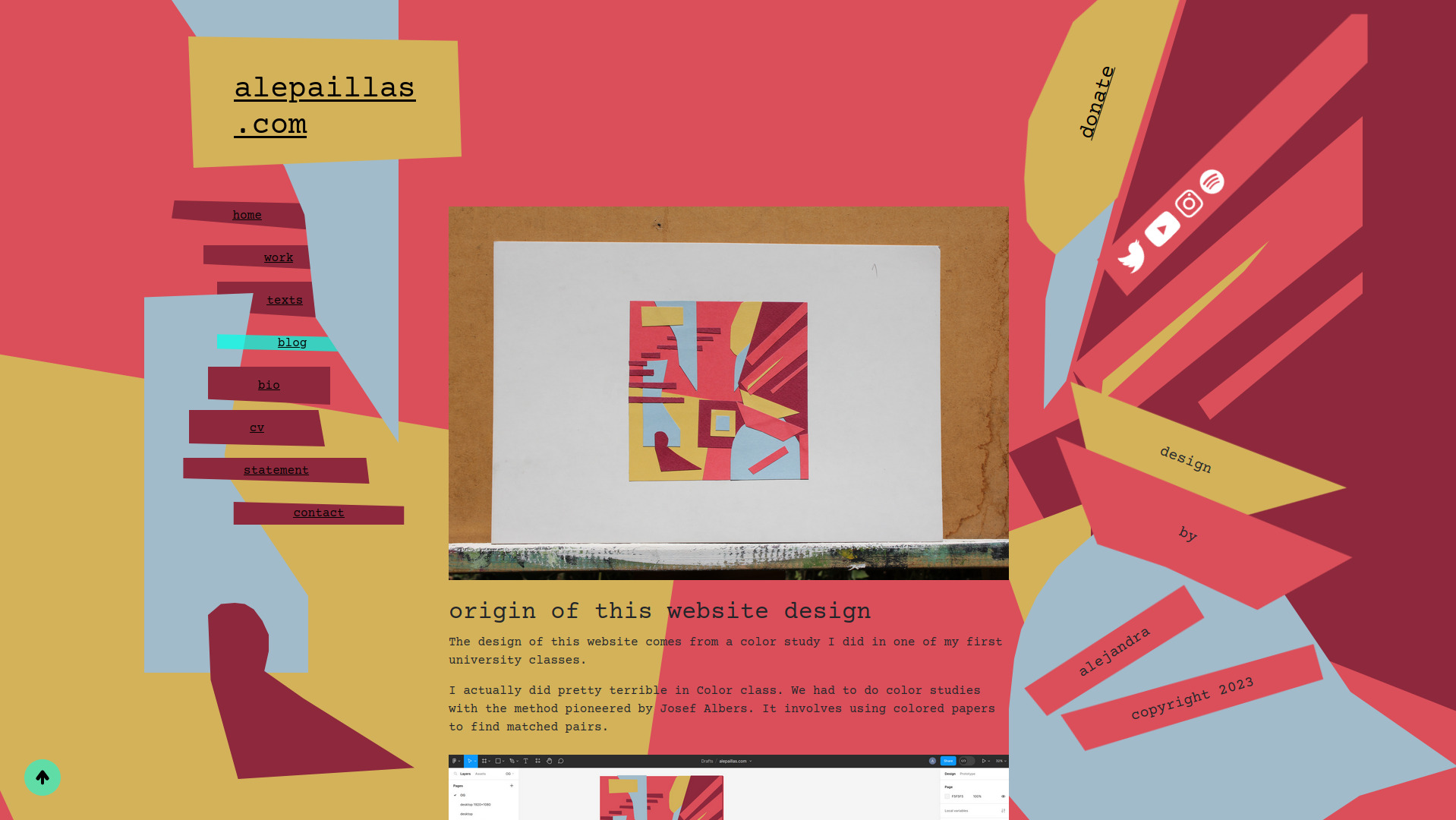
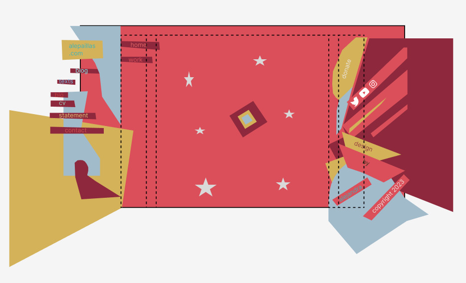
origin of this website design
The design of this website comes from a color study I did in one of my first university classes.
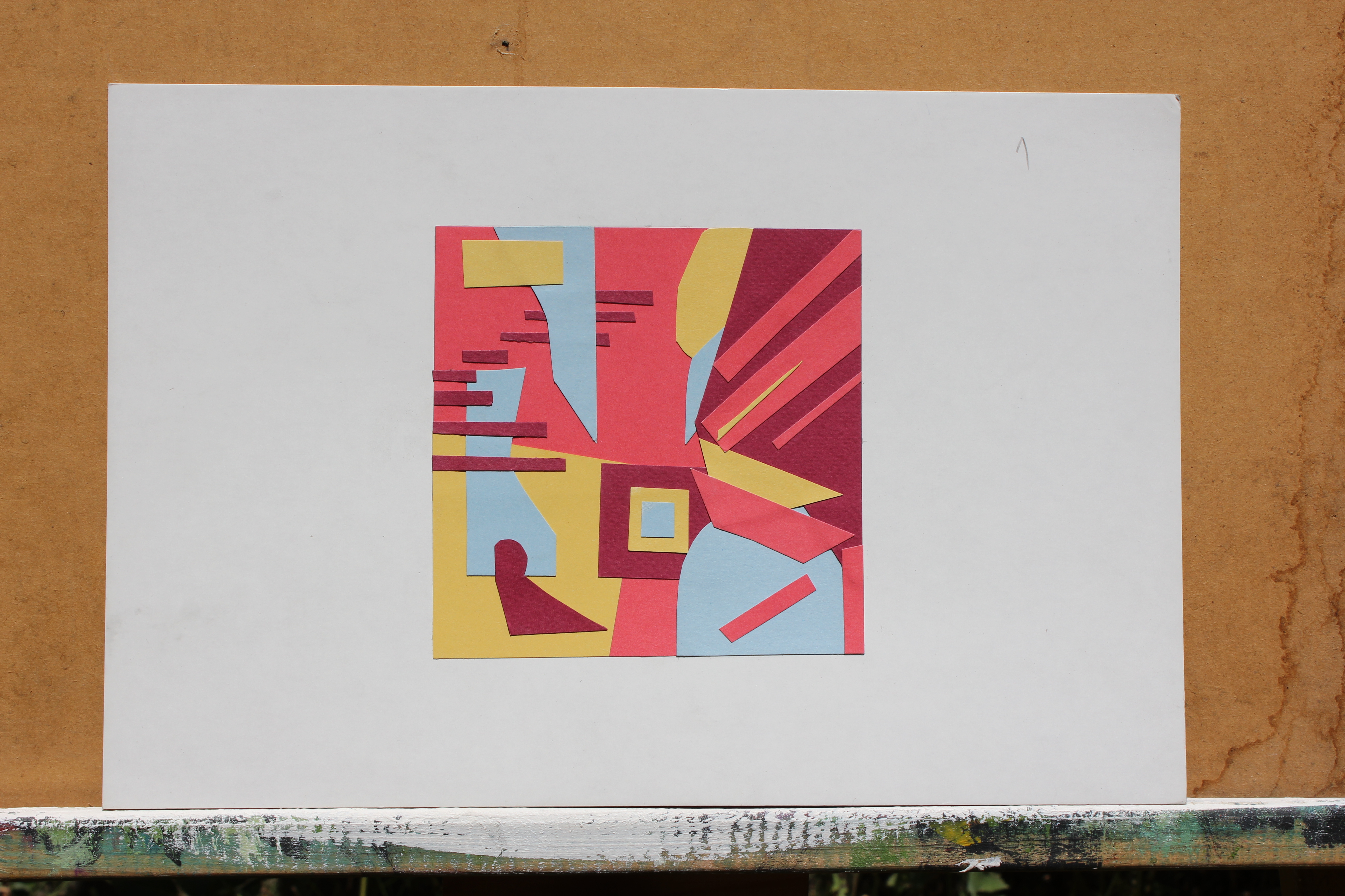
I actually did pretty terrible in Color class. We had to do color studies with the method pioneered by Josef Albers. It involves using colored papers to find matched pairs. With it you have to find colors with the same values, with opposing shades, find a third color that is a perfect mix of your pair, etc. It is pretty fun to play like that, but when in order to pass your class you need a color that you simply don't have in paper form it is torture.
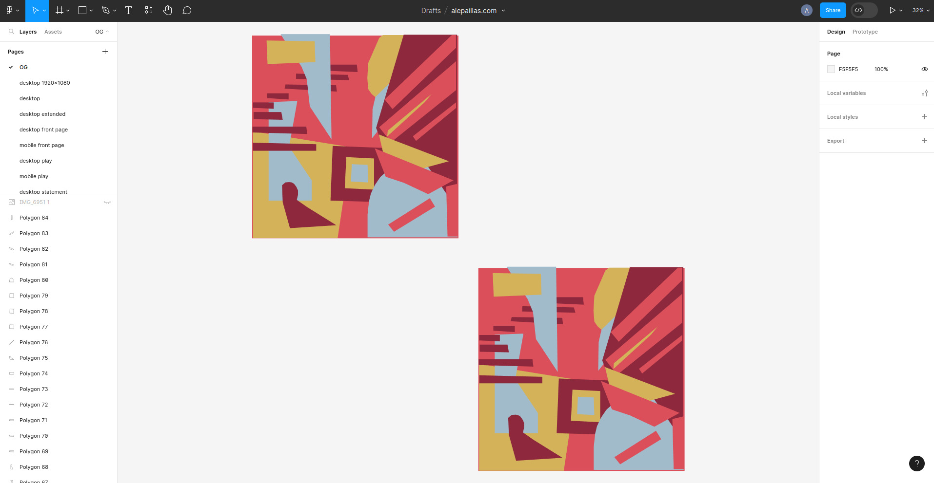
I started by digitalizing my colored papers in figma.
Adapting the design to desktop was fairly simple. I chose this study cause I thought it could work nicely.
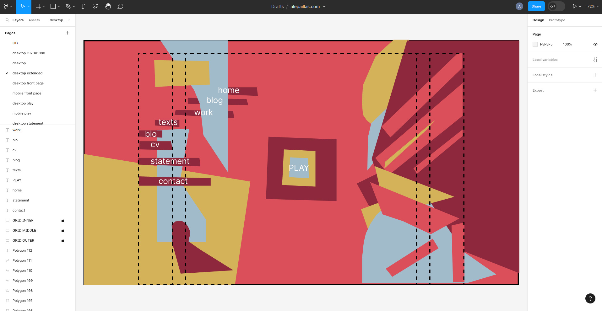
The idea is to later use this square in the center as a mouse cursor in a bullet hell kind of game. I haven't implemented that yet cause I need to learn javascript. So for now I'm just using a Pong game as a placeholder lol.
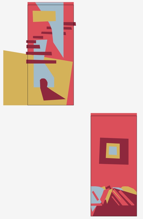
This was my wireframe for mobile. In the end I didn't flip the sidebar cause it made everything too small and the text wasn't legible enough.
Finally I did a dark theme cause honestly the colors kind of hurt my eyes at night. The shades I chose aren't that dark but I find them quite comfy and not as ugly as they look with the luminosity all the way down.
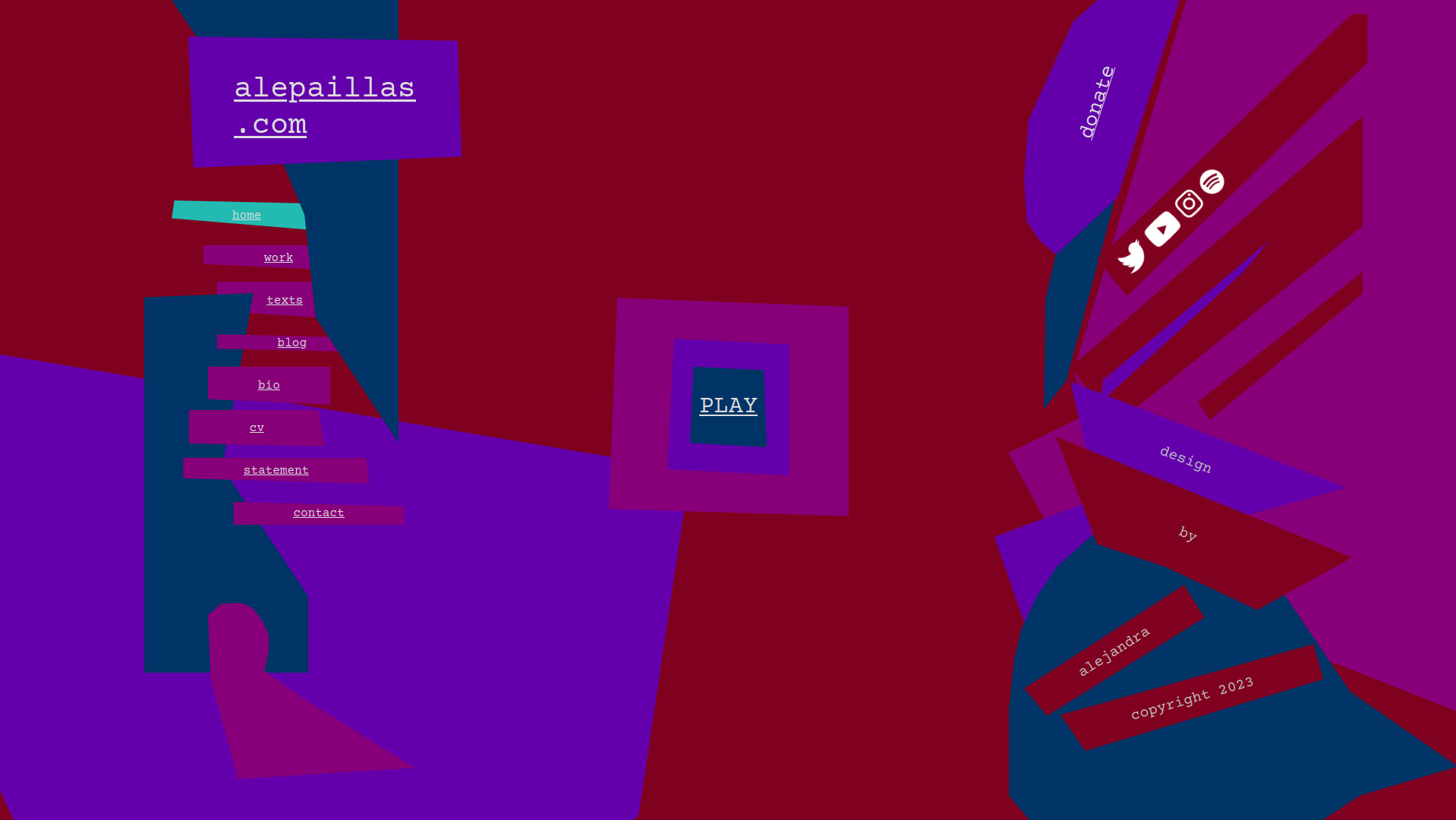
The dark mode isn't functional yet 'cause I'll do that later with javascript. But the CSS code works, so if you want to check it out you can poke into dev tools and change the body class from themeDark to theme. It looks like this: